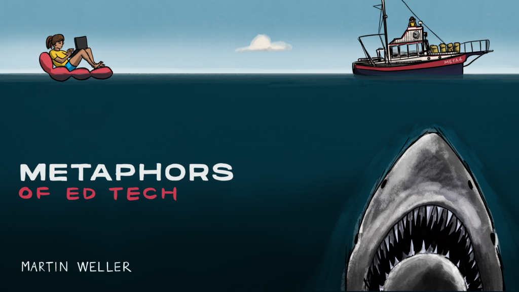
So, it’s about sharks, right?
In my previous post I talked about my uneasy foray into self promotion for my book, Metaphors of Ed Tech (did I mention I have a book out?). One key aspect of this is to have a clear visual identity. This makes posts on social media immediately recognisable and makes the book stand out from stock imagery photo type covers of young people pointing enthusiastically at computer screens. The GO-GN project has managed this better than almost any project I’ve worked on, through the theme of penguins, as drawn by Bryan Mathers.
25 Years of Ed Tech had a great Bryan cover (and remixer), so it was natural to call upon his services again for Metaphors. In conversation with Bryan we came up with a few options, that I thought I’d cover here and why we arrived at the Jaws themed one. These were just sketches so not fully worked up ideas.

The DJ metaphor refers to one mentioned in the book. I liked this one a lot (and the joke on the t-shirt). I think it would have worked well, but worried it might have “middle aged man trying to look cool” vibe to it. In a similar vein, there was this one:

This relates to the edupunk metaphor, and I loved the badges on the jacket for this one. But as a cover I felt it was perhaps off-putting to some. The following one was more general:

I liked the future and retro technology vibe of this one, but didn’t feel it really captured the book.

This one represented a number of the metaphors and in that sense, was very representative. We could have played with the different icons, but I felt that it lacked a distinctive punch.

This one in classic Soviet block style was a big favourite aesthetically. The brave new world of metaphors and a touch of space race.

In the end we went with the Jaws themed cover. Mainly this was because I wanted a Jaws themed cover (and Bryan encouraged me to go for it if I liked it and AU Press said they would trust my judgement). It was also very distinctive, and would work well on social media I thought. It relates to one chapter but is also open to other interpretations: the shark is the danger of metaphors; the shark is technology coming for you; metaphors are the means to tackle the danger, etc. It also captures the playfulness of the book I hope, and sets the tone for the reader. It looks good on a t-shirt too.
You may think one of the others would have been a better option, and I flip-flopped like a Tory Prime Minister on them a few times. I feel in general though that as academics we often underestimate the value of such a visual identity.

2 Comments
Alan Levine
This is informative to see what went into the metaphor for Metaphors. Maybe just hindsight since is out, but agree totally with the choice. The Russia one could have worked but maybe feels a bit tool old/dated (?)
And the Jaws image offers multiple interpretations- what if also the old boat is a metaphor for technology too? Sharks always get cast as villains, are they? hence the fun of https://twitter.com/thelifeofsharks
Anyhow, am enjoying first few reads into Numero 6. Congrats
mweller
Hi Alan – glad you approve of the cover. I love Life of Sharks, and I also had in mind Viz’s Pathetic Sharks https://www.amazon.co.uk/Pathetic-Sharks-Bumper-Special/dp/1870870190